Styles
Colours
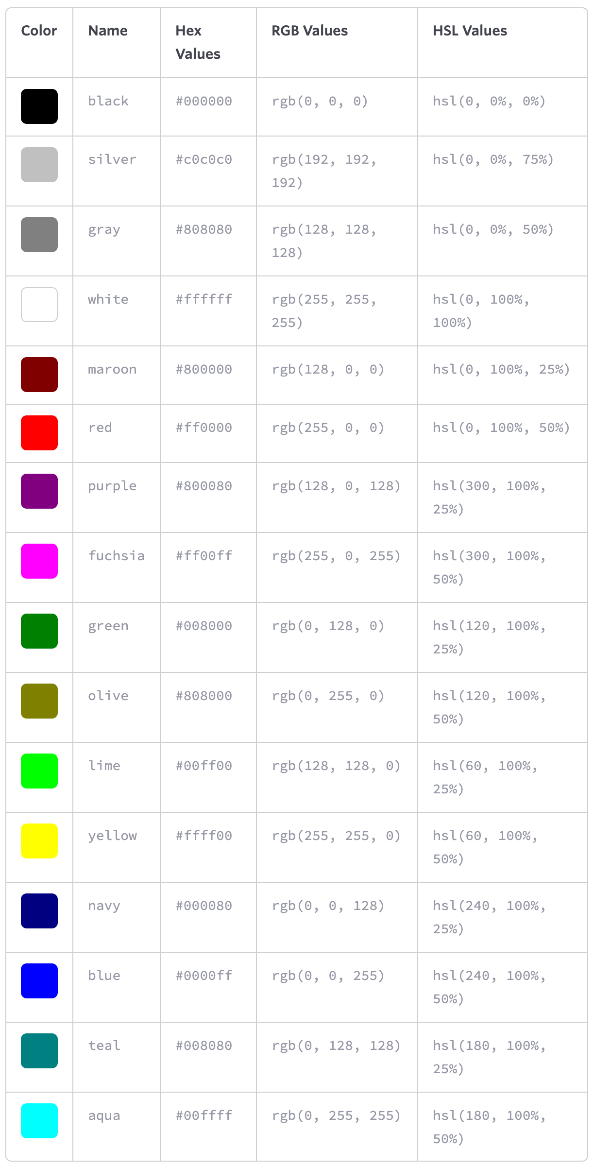
Keywords
blackwhiteblueredgreenyellow- ...
Hexadecimal notation
- white:
#000000 - black:
#ffffff
RGB(a) values
black: 0
white: 255
red - green - blue
rgb(255,255,255)
red - green - blue - alpha
rgba(255, 102, 0, .5)
HSL values
| property | value |
|---|---|
| hue | 0 to 360 (degree of a color on the color wheel) |
| saturation | 0 to 100% (0 being grayscale and 100% being fully saturated) |
| lightness | 0 to 100% (0 being completely black and 100% being completely white) |
hsl(60, 100%, 50%)
Colour functions
:root {
   --primary: red;
}

.element {
   color: hsl(from var(--primary) h s calc(l + 10%));
}
currentColor
.parent {
  color: red;
}
.child {
  border-color: currentColor;
}
Browser color in light and dark mode
background-color: Canvas;
color: CanvasText;
Length
Absolute lengths
Pixels
10px
Points
10pt
Inches
1in = 96px
Relative lengths
- Percentages (relative to the parent element)
10%
- Em (relative to the element's font-size)
1em
The default for em is 16px.
Once the font-size is set, all other em's are relative to the elements font size!
h1 {
   font-size: 2.5em;        /* 40px/16px - relative to default value */
   line-height: 1.1em;        /* 44px/40px - relative to font-size! */
   margin-bottom: 22px;
}
- Rem (relative to the root elements' (i.e.
<html>) font-size)
1rem
By default 1rem corresponds to 16px.
- Ch (relative to the width of the
0character)
7ch
Typography
Font-based properties
Font-Family
font-family: "Helvetica Neue", Helvetica, Arial, sans-serif;
Font-Size
font-size: 14px;
Fluid typography via area
.static-frame {
   --area: calc((100vw * 100vh) / (320px * 680px));
   font-size: calc(var(--area)* 1em) !important;
}
Font-Weight
font-weight: 600;
100,200,300,400,500,600,700,800, and900normal–400bold–700bolderlighterinherit
Attempting to use a weight that’s not available for a given typeface will cause those styles to default to the closest value
Font-Style
font-style: italic;
normalitalicobliqueinherit
Font-Variant
font-variant: small-caps;
normalsmall-capsinherit
Font
font-stretch: ultra-condensed|extra-condensed|condensed|semi-condensed|normal|semi-expanded|expanded|extra-expanded|ultra-expanded|initial|inherit;
Line height
line-height: 22px;
line-height: 150%;
line-height: 1.5;
font-size: 15px;
the distance between two lines of text (often referred to as leading)
vertically center a single line of text within an element by setting line-height equal to the elementsheight → buttons, alert messages, ...
BEST PRACTISE: set to around one and a half times our font-size property value
Shorthand Font Properties
font: font-style font-variant font-weight font-size/line-height font-family;

font: 14px/24px "Source Code Pro", Inconsolata, "Lucida Console", Terminal, "Courier New", Courier;

font: italic small-caps bold 14px/22px "Helvetica Neue", Helvetica, Arial, sans-serif;
Text-based properties
Text align
text-align: center;
leftrightcenterjustifyinherit
Text decoration
text-decoration: underline;
text-decoration: underline overline;
noneunderlineoverlineline-throughinherit
Text indent
indent the first line of text within an element, as is commonly seen in printed publications
text-indent: 20px;
text-indent: -5px;
Text shadow
text-shadow: 3px 6px 2px rgba(0, 0, 0, .3);
text-shadow: horizontal offset vertical offset blur radius color
Text transform
text-transform: uppercase;
nonecapitalizeuppercaselowercaseinherit
Letter spacing
letter-spacing: 2px;
letter-spacing: -0.5em;
none
Word spacing
word-spacing: 20px;
word-spacing: 0.25em;
none
Text Ellipsis
.ellipsis-text {
  overflow: hidden;
  white-space: nowrap;
  text-overflow: ellipsis;
}
.ellipsis-box {
  overflow: hidden;
  display: -webkit-box;
  -webkit-box-orient: vertical;
  -webkit-line-clamp: 4;
}
Text columns
.column-text {
   line-height: 1.2;
   columns: 2 30ch;
   gap: 4rem;
   max-width: 100ch;
}

.column-layout {
    column-count: 2;
    columns: 2 30ch;
    column-rule: 2px dotted orange;
    column-gap: 1em;
}
.column-child {
    column-span: all;
    column-fill: auto;
    column-fill: balance;
    break-inside: avoid;
    break-inside: avoid-column;
    break-inside: avoid-page;
}
Colour
color: #fff;
Websafe Fonts
- Arial
- Courier NewCourier
- Garamond
- Georgia
- Lucida Sans, Lucida Grande, Lucida
- Palatino Linotype
- Tahoma
- Times New Roman, Times
- Trebuchet
- Verdana
Embedding Web Fonts
@font-face {
    font-family: "Lobster";
    src: local("Lobster"), url("lobster.woff") format("woff");
    font-weight: bold;
    font-style: italic;
    font-variant: small-caps;
    font-stretch: condensed;
}
Backgrounds
Shorthand
background: white;
background: #b2b2b2 url("alert.png") 20px 10px no-repeat;
Background Colour
background-color: #b2b2b2;
Background Image
background-image: url("image.png");
default: repeat horizontally and vertically from the top left of the given element to fill up the element’s background
Background Repeat
background-repeat: no-repeat;
repeat(default)repeat-xrepeat-yno-repeat
Background Position
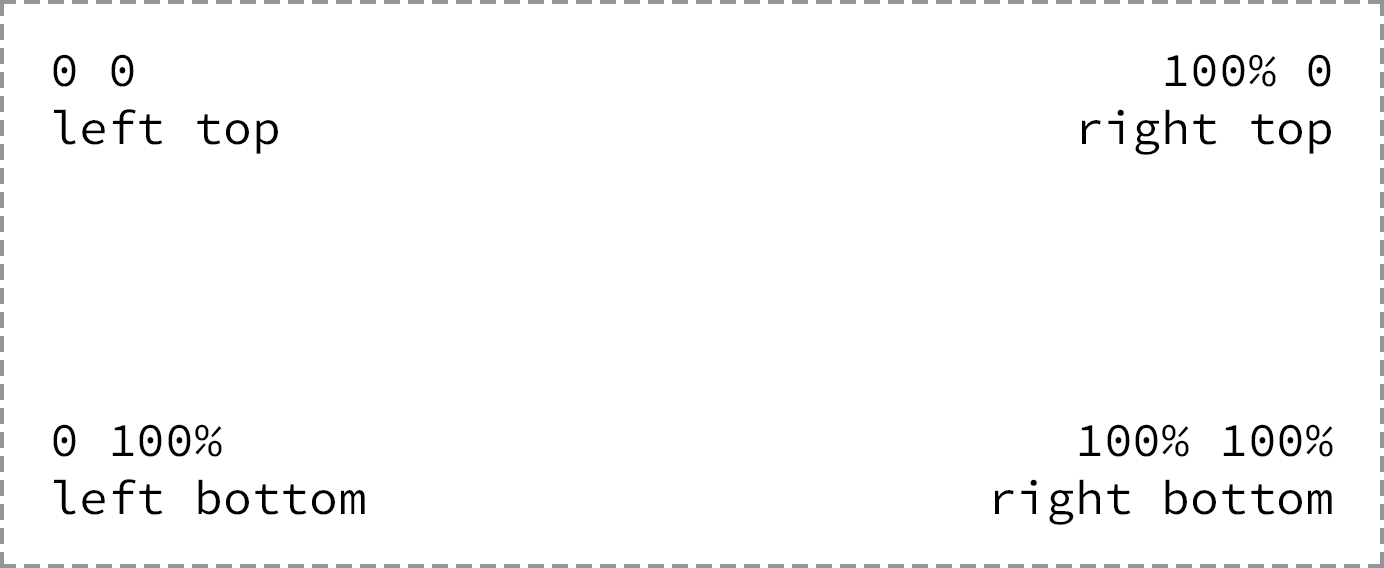
background-position: horizontal-offset vertical-offset;
background-position: 20px 10px;
background-position: left top;
background-position: center center;
background-position: 50% 50%;
default: left top corner of an element
position relative to top left corner
top, right, bottom, left, and center
Example: Background Sprites
span {
     background: url("sprite.png") 0 0 no-repeat;
    height: 16px;
    width: 16px;
}
.second-sprite {
     background-position: -16px 0;
}
.third-sprite {
     background-position: -32px 0;
}
Background Size
background-size: width height;
background-size: auto 75%;
background-size: cover;
background-size: contain;
auto: may be used as either the width or height value to preserve the aspect ratio of the background imagecover: the background image will be resized to completely cover an element’s width and height, the background image’s original aspect ratio will be preservedcontain: the background image will be resized to reside entirely contained within an element’s width and height
Background Clip
background-clip: border-box;
border-box(default)padding-boxcontent-box
Multiple Backgrounds
The background image value that comes first will be the foremost background image
background: url("foreground.png") 0 0 no-repeat,
            url("middle-ground.png") 0 0 no-repeat,
            url("background.png") 0 0 no-repeat;
These shorthand values may also be broken up into comma-separated values across the background-image, background-position, and background-repeat properties.
Gradients
Linear Gradient
background: #466368;
background: -webkit-linear-gradient(#648880, #293f50);
background:    -moz-linear-gradient(#648880, #293f50);
background:         linear-gradient(#648880, #293f50);
change the direction:
to bottom: default, from the top to the bottom of an elementto right: from the left of an element to the rightto right bottom: from the left top to the right bottom of an element315deg: gradient to move to the left top of an element135deg: to the right bottom of an element
Radial Gradient
from the inside to the outside of an element
background: #466368;
background: -webkit-radial-gradient(#648880, #293f50);
background:    -moz-radial-gradient(#648880, #293f50);
background:         radial-gradient(#648880, #293f50);
background: radial-gradient(
  circle 30px at 40px 40px,
  rgba(255, 0, 0, 0),
  rgba(255, 0, 0, 1)
);
Conic Gradient
--gradient-conic: conic-gradient(from .5turn at bottom center, lightblue, white);
Colour Stops
background: #648880;
background: linear-gradient(to right, #f6f1d3, #648880, #293f50);
background: #648880;
background: linear-gradient(to right, #f6f1d3, #648880 85%, #293f50);
Cool Gradients
:where(html) {
   --gradient-rainbow:
      linear-gradient(0deg,   hsla(0   100% 50% / 80%), hsla(0   100% 50% / 0) 75%),
      linear-gradient(60deg,  hsla(60  100% 50% / 80%), hsla(60  100% 50% / 0) 75%),
      linear-gradient(120deg, hsla(120 100% 50% / 80%), hsla(120 100% 50% / 0) 75%),
      linear-gradient(180deg, hsla(180 100% 50% / 80%), hsla(180 100% 50% / 0) 75%),
      linear-gradient(240deg, hsla(240 100% 50% / 80%), hsla(240 100% 50% / 0) 75%),
      linear-gradient(300deg, hsla(300 100% 50% / 80%), hsla(300 100% 50% / 0) 75%);

   --gradient-mellow: linear-gradient(to bottom right,#1f005c, #5b0060, #870160, #ac255e, #ca485c, #e16b5c, #f39060, #ffb56b);
}
Border
border: 3px solid maroon;
border:widthstroke-typecolor
Border Radius
border-radius: 50%;
border: 3px solid maroon;
Gradient Border
.gradient-border {
   --size: 0.3em;
   --gradient-conic: conic-gradient(from .5turn at bottom center, red, blue);

   border-width: var(--size);
   border-style: solid;
   border-image-slice: 1;
   border-image-source: var(--gradient-conic);
}
Box Shadow
box-shadow: 3px 6px 2px rgba(100, 100, 100, .3);
box-shadow: (inset)horizontal offsetvertical offsetblur radius(spread)color
Transforms
Scale
transform: scale(2);
Translate
transform: translate(10px, -10px);
Rotate
transform: rotate(30deg);
Skew
transform: skew(30deg);
Transform style
transform-style: preserve-3d;
Images
Preserve pixel contrast (e.g. pixel art)
image-rendering: pixelated;
Mask
mask: url(#svg-id);
mask: url(mask-image.png);
mask: url(mask-image1.png) add, url(mask-image2.png);
Filter
- Brightness
- Contrast
- Drop Shadow
- Grayscale
- Hue-Rotate
- Opacity
- Saturate
- Sepia
- Blur
Blur
filter: blur(1px);
Hue Rotation
filter: hue-rotate(180deg);
Backdrop Filter
- Note: currently not supported by Firefox!
.glass {
  background: rgba(200,200,200,0.2);
  -webkit-backdrop-filter: blur(10px);
          backdrop-filter: blur(10px);
}
Blend Mode
mix-blend-mode: multiply;
Blend mode categories
- Normal
- Darken (
darken,multiply,color-burn) - Lighten (
lighten,screen,color-dodge) - Contrast (
overlay,soft-light,hard-light) - Inversion (
difference,exclusion) - Component (
hue,saturation,color,luminosity)
Background Blend Mode
lightendarkenmultiply
.lightened-background {
  background-color: coral;
  background-image: url(../assets/favicon.png);
  background-blend-mode: lighten;
}
Clip Path
Hover me
clip-path: inset(0 0 50% 0);
clip-path: inset(0 -100px); /* 0 top+bottom; -100px left+right */
Options
inset()circle()ellipse()polygon()
Text selection
::-moz-selection {
    background-color: #BA9EB0;
    color: #ffffff;
}

::selection {
    background-color: #BA9EB0;
    color: #ffffff;
}
Cursor
- default
- pointer
- text
cursor: default;
cursor: pointer;
cursor: text;
Resize elements
resize: both;
resize: vertical;
resize: horizontal;
User Experience (Zoom, scroll etc.)
User select
.text {
  -webkit-user-select: none;
  user-select: none;
}
Touch action
avoid confusion between browser behaviour for touch devices such as scrolling, zooming and interactive/draggable elements on screen.
section {
  touch-action: auto;
  touch-action: none;
  touch-action: pan-x;
  touch-action: pan-left;
  touch-action: pan-right;
  touch-action: pan-y;
  touch-action: pan-up;
  touch-action: pan-down;
  touch-action: pinch-zoom;
  touch-action: manipulation; /* avoid double tap to zoom */
}
Text Clip + fixed background
background: radial-gradient(red, blue) fixed;
-webkit-background-clip: text;
-webkit-text-fill-color: transparent;
Caret color
caret-color: red;
caret-color: transparent;
Color scheme
color-scheme: light;
color-scheme: dark;
Pointer Events
- make an element "see-through" for any pointer events (click & touch)
pointer-events: none;
Rendering Optimisation
hints to browsers how an element is expected to change – can help fix performance problems
will-change: transform;
Indicate that an element and its contents are independent of the rest of the document tree. Changes within an element with containment applied are not propagated outside of the contained element to the rest of the page, leading to performance benefits through fewer DOM re-renders.
contain: strict;
contain: size;
contain: layout;
contain: paint;
contain: style;
contain: content;
Scroll
Scroll Padding and Margin
.scrollport {
  padding: 1em;
  scroll-padding: 1em;
}

.scrollport > * {
  margin: 2em;
  scroll-margin: 2em;
}
Overscroll behavior
html {
  overscroll-behavior: auto;
  overscroll-behavior: none;
  overscroll-behavior: contain;   /* eat up momentum when overscrolling */
  overscroll-behavior-y: contain;
}
Overflow scrolling
use momentum-based scrolling for a given element
-webkit-overflow-scrolling: auto;
-webkit-overflow-scrolling: touch;
Customize Scrollbar
Safari Scrollbar
body::-webkit-scrollbar {
  width: 16px;
}

body::-webkit-scrollbar-track {
  background: #111;
}

body::-webkit-scrollbar-thumb {
  background-color: #00082a;
  border: solid #111;
  border-width: 0 2px;
}
Hide scroll bar
body::-webkit-scrollbar {
  width: 0;
  height: 0;
  display: none;
}

.firefox-only {
  scrollbar-width: none;
}
Smooth scroll
(e.g. when ID changes in URL)
html {
  scroll-behavior: smooth;
}
a11y-tip: Turn on smooth scroll only if user has no preference!
@media (prefers-reduced-motion: no-preference) {
  html {
    scroll-behavior: smooth;
  }
}
Perspective scroll effect
.scrollport {
  perspective: 10px;
  perspective-origin: center center;
}
.scrollport, .scroll-section {
  transform-style: preserve-3d;
}
.scroll-section > h2 {
  transform: translatez(-5px);
}
Scroll snap
.scrollport {
  overscroll-behavior-x: contain;

  -ms-scroll-snap-type: x mandatory;
  scroll-snap-type: x mandatory;
  scroll-snap-type: x proximity;
  scroll-snap-type: y mandatory;

  overflow: auto hidden;
}

.scroll-item {
  scroll-snap-align: start;
  scroll-snap-align: center:
  scroll-snap-align: end;

  scroll-snap-stop: always;
}
Single Snap
.snap-x {
  scroll-snap-type: x mandatory;
}

.snap-x > :nth-child(5) {
  scroll-snap-align: center:
}
Fake rubberbanding
.overscroller .item .item .item .overscroller
.scrollport {
  scroll-snap-type: x mandatory;
}

.scrollport > :not(.overscroller) {
  scroll-snap-align: start:
}
Start item
@keyframes scroll-start {
  from { scroll-snap-align: center; }
  to   { scroll-snap-align: unset;  }
}

.starting-scroll-snap-item {
  animation: scroll-start 2ms;
}
Pull to refresh
- tiny snap point at top of refresh
el - delayed snap point on tiny
el - scrollend checks scrollTop to be
- set loading attribute
- wait for
fetch() scrollIntoView()<main>- ScrollTimeline for flare
- snap-stop always on main for UX
Page Transitions
global CSS
@view-transition {
  navigation: auto;
}
Page 1 HTML
>a href="page-2" style="view-transition-name: beaver">Beaver>/a>
Page 2 HTML
>h1 style="view-transition-name: beaver">Beaver>/h1>
Webkit specific styles
System fonts
font-family: system-ui;
font-family: ui-sans-serif;
font-family: ui-serif;
font-family: ui-monospace;
font-family: ui-rounded;
Safe areas
env(safe-area-inset-top)
env(safe-area-inset-bottom)
env(safe-area-inset-left)
env(safe-area-inset-right)
Text adjustments
-webkit-text-size-adjust: none | 200% | auto;
Custom link highlighting
- applies to all
-webkit-tap-highlight-color: rgba(200,0,0,0.4);
iOS highlighting
- applies to link or a JavaScript clickable element
- the
:activepseudo-state is only triggerd if touch event is set on HTML element
<button class="action" ontouchstart="" style="-webkit-tap-highlight-color: rgba(0,0,0,0);">Testing Touch on iOS</button>
Font Smoothing
.app {
   -webkit-font-smoothing: antialiased;
   -moz-osx-font-smoothing: grayscale;
}
Keyboard Enter Key Title
<div id="editor" contenteditable="true" enterkeyhint="send"></div>
Chromium specific styles
Hack: no number buttons
input[type=number]::-webkit-outer-spin-button,
input[type=number]::-webkit-inner-spin-button { -webkit-appearance: none; margin: 0; }
input[type=number] { -moz-appearance: textfield; }