CSS Basics
The Cascade
- cascades from top to bottom of a style sheet
- the specificity of the selectors breaks the cascade
- Every selector in CSS has a specificity weight
| selector | specificity weight |
|---|---|
| type | 0-0-1 |
| class | 0-1-0 |
| ID | 1-0-0 |
style-attribute |
overrides the above |
!importatnt |
hightest specificity |
Therefore, the ID selector will take precedence regardless of where it appears in the cascade, e.g. <div id="circle"></div> will be red:
#circle {
    background: red;
}

div {
    background: green;
}
Hack the Cascade
ul {
  list-style: circle !important;
}
Unset
Change all properties to the parent value if inheritable or the initial value if not
all: unset;
Comments
/* this is a comment in CSS */
Vendor prefixes
- Mozilla Firefox:
-moz- - Opera:
-o- - Microsoft Internet Explorer:
-ms- - Webkit (Google Chrome and Apple Safari):
-webkit-
They still provide support for some of the older browsers that leveraged them. Use them if you wish to support older browsers.
CSS Variables
Define base values for variables in :root
:root {
  --bg-colour: #C5C6C7;
  --text-colour: #1A1B1C;
}
Overwrite variables for specific contexts
.dark {
  --bg-colour: #1A1B1C;
  --text-colour: #C5C6C7;
}
Use variables as property values
section {
  background-color: var(--bg-colour);
  color: var(--text-colour);
}
Fallback value (e.g. if clamp() is not supported)
:root {
  --padding: clamp(1rem, 2vw, 2rem);
}

section {
  padding: var(--padding, 1.5rem);
}
Manipulate CSS Variables from JavaScript
CSS
.flashlight {
  --cursorX: 0px;
  --cursorY: 0px;

  top: var(--cursorX);
  left: var(--cursorY);
}
JavaScript
let flashlight = document.querySelector('.flashlight');
flashlight.style.setProperty("--cursorX", e.offsetX + "px");
flashlight.style.setProperty("--cursorY", e.offsetY + "px");

flashlight.style.removeProperty("--cursorY");
Selectors
selector {
    property: value;
}
| Selector | CSS |
|---|---|
| Type | div |
| Class | .class |
| ID | #id |
| Descendant | .ancestor .descendant |
| Direct Child | .parent > .child |
| General Sibling | .element ~ .sibling |
| Adjacent Sibling | .element + .sibling |
| Attribute Present | [href] |
| Attribute Equals | [href="value"] |
| Attribute Contains | [href*="value"] |
| Attribute Begin | [href^="value"] |
| Attribute End | [href$="value"] |
| Attribute Spaced | [href~="value"] |
| Attribute Hyphenated | `[href |
Type selector
identifies an element based on its type, i.e. HTML tag
div { /* ... */ }
Class selector
allow to apply the same styles to different elements at once by using the same class attribute value across multiple elements
.class { /* ... */ }
GOOD PRACTISE: value that refers to the content of an element
ID selector
target only one unique element per page at a time (not good practise)
#id { /* ... */ }
Child Selectors
Descendant Selector
*<a> element must reside within a <div> with the class attribute value parent-class
- matches every element that follows an identified ancestor
- descendant element does not have to come directly after the ancestor element inside the document tree
div.parent-class a {
    /* ... */
}
<div class="parent-class">
    <p>
        <a href="#"></a> <!-- selected -->
    </p>
    <a href="#"></a> <!-- selected -->
</div>
Direct Child Selector
only identify elements that fall directly within some other element
.parent-class > a {
    /* ... */
}
<div class="parent-class">
    <p>
        <a href="#"></a> <!-- not selected -->
    </p>
    <a href="#"></a> <!-- selected -->
</div>
Sibling Selectors
General Sibling Selector
- elements that share a common parent
- element is only selected if it comes after the specified element
.element ~ .sibling {
    /* ... */
}
<div class="parent">
    <div class="sibling"></div> <!-- not selected -->
    <div class="element"></div>
    <div class="sibling"></div> <!-- selected -->
    <div class="sibling"></div> <!-- selected -->
</div>
Adjacent Sibling Selector
- elements that share a common parent
- only select sibling elements directly following after another sibling element
.element + .sibling {
    /* ... */
}
<div class="parent">
    <div class="sibling"></div> <!-- not selected -->
    <div class="element"></div>
    <div class="sibling"></div> <!-- selected -->
    <div class="sibling"></div> <!-- not selected -->
</div>
Attribute Selectors
- Attribute Present Selector: element includes an attribute or not
a[target] {
    /* ... */
}
.links[id] {
    /* ... */
}
[class] {
    /* ... */
}
<a href="">Link 1</a> <!-- not selected -->
<a href="" target="_blank">Link 1</a> <!-- selected -->

<nav class="links" id="nav"></nav> <!-- selected -->
<aside class="links"></aside> <!-- not selected -->

<div></div> <!-- not selected -->
<a class="button" href="#"></a> <!-- selected -->
- Attribute Equals Selector: element includes an attribute and desired matching value
a[href="https://markusdoppler.at"] {
    /* ... */
}
- Attribute Contains Selector: part of an attribute value
a[href*="markusdoppler"] { /* ... */ }
- Attribute Begin Selector: attribute value should begin with the stated value
a[href^="https://"] { /* ... */ }
- Attribute End Selector: attribute value should end with the stated value
a[href$=".pdf"] { /* ... */ }
- Attribute Spaced Selector: attribute value that should be whitespace-separated, with one word matching the exact stated value
a[rel~="tag"] { /* ... */ }
- Attribute Hyphenated Selector: attribute value may be hyphen-separated however the hyphen-separated words must begin with the stated value
a[lang|="en"] { /* ... */ }
Pseudo-Classes
:active:checked:disabled:empty:enabled:first-child:first-of-type:focus:focus-visible:focus-within:hover:in-range:invalid:lang(language):last-child:last-of-type:link:not(selector):nth-child(n):nth-last-child(n):nth-last-of-type(n):nth-of-type(n):only-of-type:only-child:optional:out-of-range:read-only:read-write:required:root:target– element's id matches fragment in URL:valid:visited
NEW:
:not():is():where():has()
Pseudo Classes
.item:not(.dragging) { ... } /* Chrome 88, iOS 9 */

.item:where(.active) { ... } /* Chrome 88, iOS 14 */
.item:where(.active, .allowed) { ... } /* Chrome 88, iOS 14 */

.item:is(.active) { ... } /* Chrome 88, iOS 14 */
.container :is(.mid, .center, .main) .detail { ... } /* Chrome 88, iOS 14 */

.item:focus-within { ... }
.item:focus-visible { ... } /* iOS 15.4 (previously focus-ring) */
:where()has specificity 0,:is()has highest specificity within it- selectors inside
:isand:wherecan be invalid, others still applied
Link Pseudo-classes
link specific (define if a link has or hasn’t been visited)
a:link {
    /* ... */
}
a:visited {
    /* ... */
}
User Action Pseudo-classes
when a user moves their cursor over the element
a:hover {
    /* ... */
}
when a user engages an element, such as clicking on an element
a:active {
    /* ... */
}
when a user has made an element the focus point of the page, often by using the keyboard to tab from one element to another
a:focus {
    /* ... */
}
Note: a:hover must come after a:link and a:visited in the CSS definition in order to be effective.
Note: a:active must come after a:hover in the CSS definition in order to be effective.
User Interface State Pseudo-classes
user interface state of elements, particularly within form elements
the :enabled pseudo-class selects an input that is in the default state of enabled and available for use
the :disabled pseudo-class selects an input that has the disabled attribute tied to it
input:enabled {
    /* ... */
}
input:disabled {
    /* ... */
}
for checkbox and radio button input elements
:checked pseudo-class selects checkboxes or radio buttons that are checked
when a checkbox or radio button has neither been selected nor unselected it lives in an indeterminate state
input:checked {
    /* ... */
}
input:indeterminate {
    /* ... */
}
Structural & Position Pseudo-classes
selects the first/last/only child element within its parent element
li:first-child a {
    /* ... */
}
li:last-child a {
    /* ... */
}
li:only-child a {
    /* ... */
}
will select the first/last/only element of its type within a parent
p:first-of-type {
    /* ... */
}
p:last-of-type {
    /* ... */
}
p:only-of-type {
    /* ... */
}
will select the element(s) specified by n
p:nth-child(n)
p:nth-last-child(n)
p:nth-of-type(n)
p:nth-last-of-type(n)
Examples for n:
1
5
3n
2n+1
odd
even
n+2
2n-1
-3n+12
- Counting begins at
1, i.e.nmust be a positive value - General syntax is
(a×n)±b: everya'th element starting atb(bcan be negative; ifais negative,b has to be positive) n+b: every element starting at theb'th
Example:
p:nth-child(n+1) {
    /* ... */
}
<p></p> <!-- not selected -->
<p></p> <!-- selected -->
<p></p> <!-- selected -->
<p></p> <!-- selected -->
Target Pseudo-class
selects the element whose ID attribute value matches the URI fragment identifier (part after # in a URL)
:target { /* ... */ }
Empty Pseudo-class
selects elements that do not contain children or text nodes
:empty { /* ... */ }
Negation Pseudo-class
takes an argument which is filtered out from the selection to be made
div:not(.lovely) { /* ... */ }
Pseudo-elements (also ::pseudo-element)
-
::after -
::before -
::first-letter -
::first-line -
::selection -
::marker -
only one pseudo-element may be used within a selector at a given time
-
first letter/line of text within an element
::first-letter
::first-line
Generated Content Pseudo-elements
- create new
inlinelevel pseudo-elements just inside the selected element
::before {
    content: "";
}
::after {
    content: "(" attr(href) ")";
}
Fragment Pseudo-element
identifies part of the document that has been selected, or highlighted, by a user’s actions
::selection {
    /* ... */
}
::-moz-selection {
    /* ... */
}
Universal selector
- selects all elements
* {
    /* ... */
}
- selects every imaginable element
*, *::before, *::after {
    /* ... */
}
Combining selectors
general syntax
prequalifiers key-selector {
    /* ... */
}
combined syntax
only select <div> elements with the class class-name (not the best practise though)
div.class-name {
    /* ... */
}
select all elements within a parent
.parent > * {
    /* ... */
}
Selecting several elements
- for elements that share the same style
- apply style to several selectors at one time, seperated with commas
,
b, emph {
    /* ... */
}
The Box model

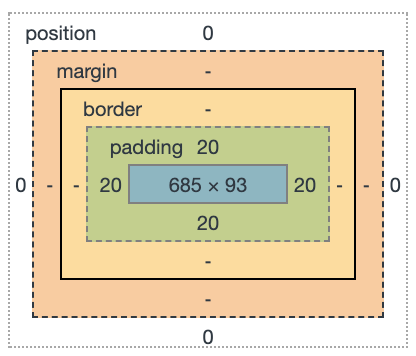
Properties
heightwidthpaddingbordermargin
Width & Height
for block- and inline-block-level elements
width: 100px;
height: 50px;
min/max width
max-width: 200px;
min-width: 900px;
The best way to use min-width is to define a width value as a percentage and use an absolute value for the min-width property
Margin & Padding
INFO: margin and padding properties are completely transparent and do not accept any color values
Shorthands
- all four sides
margin: 20px;
padding: 5px;
top+bottom&left+right
margin: 10px 20px;
padding: 10px 20px;
- unique values for all four sides (
top-right-bottom-left)
margin: 10px 20px 30px 0px;
padding: 10px 20px 30px 0px;
Longhands
margin-top: 20px;
margin-right: 20px;
margin-bottom: 20px;
margin-left: 20px;

padding-top: 20px;
padding-right: 20px;
padding-bottom: 20px;
padding-left: 20px;
BEST USAGE: When we wish to identify only one margin or padding value
Logical properties
.item {
   margin-block-end: 0.5em;
   margin-block: 0.5em;
   padding-inline: 0.5em;
   border-block: 1px solid black;
   padding-inline: 1px solid black;
   max-inline-size: 400px;
}
Margin Center Trick
in order to center a block-level element (with width property set) inside its parent element, one can use
margin: 0 auto;
Margin Overlap Trick
Set a negative margin to make it overlap its parent box (and possibly other content)
margin: -66px 0 22px 0;
Padding Aspect Ratio Trick
%-value for padding specifies a padding in % of the width of the parent element (even the vertical padding!)
.aspect-ratio-box {
  width: 100%;
  padding-bottom: 66.67%;
}
Border
shorthand
border: 3px solid #fba;
longhand
border-width
[→ CSS Lengths]
border-style
soliddoubledasheddotted
border-color
[→ CSS Color]
border-top
border-right
border-bottom
border-left
border-top-width
border-top-style
border-top-color
Border Radius
- round all four corners equally
border-radius: 5px;
border-radius: 50%;
- round the
top-left/bottom-rightandtop-right/bottom-leftcorners
border-radius: 5px 10px;
- round the
top-left,top-right,bottom-right, andbottom-leftcorners
border-radius: 5px 10px 15px 20px;
longhand
border-top-right-radius: 5px;
Box Sizing
*,
*:before,
*:after {
    -webkit-box-sizing: border-box;
        -moz-box-sizing: border-box;
            box-sizing: border-box;
}
possible values
content-box: default, which means box model is an additive designborder-box: anyborderorpaddingproperty values are included within thewidthandheightof an element.
Min, Max, Clamp
Min
.a {
  padding: min(100px, 10vw);
}
Max
.b {
  padding: max(100px, 10vw);
}
Clamp
.b {
  padding: clamp(1rem, 10vw, 2rem);
}
Fluid Fontsize
.c {
  font-size: clamp(1.75rem, 3vw, 2.1rem);
}

@supports not (font-size: clamp(1.75rem, 3vw, 2.1rem)) {
  .c {
    font-size: min(max(1.75rem, 3vw), 2.1rem);
  }
}
Calc
.d {
  padding: calc(50% - var(--sizeHeader) - 1rem);
}